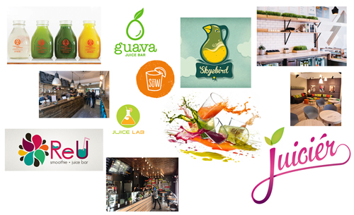
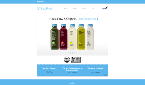
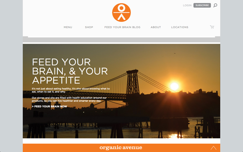
Market Research: Competitors
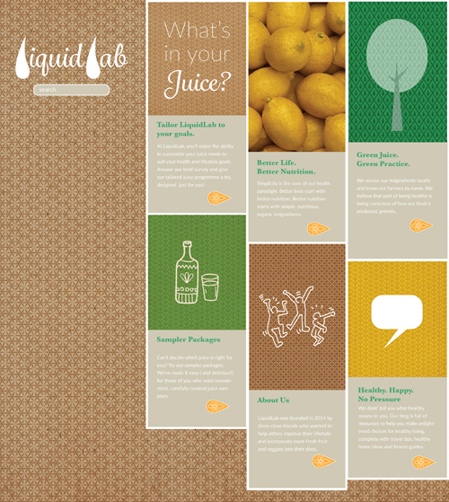
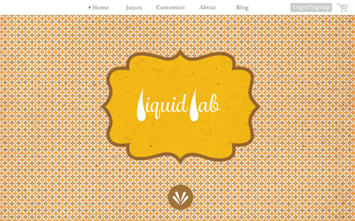
Objective: Brand LiquidLab's digital experience as a high-end juice bar and supplier, with a boutique online presence for discerning professional women focused on finding individualized products customized to their healthy, unique lifestyles.
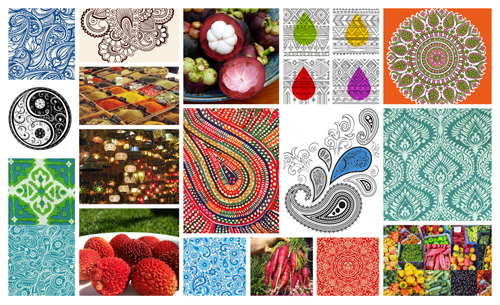
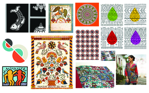
Strategy: Attract primary market of health-minded professional women by setting LiqiuidLab apart from the competition. Design challenges are a) to emphasize the tailored nature of the juice products and b) utilize elements that evoke and represent the worldly, fashion-discerning, trend-aware and health-minded customer . Global and pan-cultural motifs, colors associated with nature and textures reminiscent of recycled materials will be employed to signify wholesome, sustainable and organic products and services.


LiquidLab is a fictional company with digital design requirements addressed in the final project creative brief, supplied through the course Visual Design, Spring 2015 at General Assembly - DC. The class was taught by Chloe Magner, Lead Mobile Designer at the Washington Post, along with teaching assistants Kristian Dela Cruz, UX/UI Designer at Booz Allen Hamilton and Katharine Molloy, Graphic Designer at Vox Media. This was crafted and designed by Lawrence Getubig.